More accurately, I could call this "what I didn't think about".
Because, you put a lot of thought into naming a business, don't you?
I certainly did.
I'd had an idea rumbling along of creating a book for people with advanced dementia. In May, I decided to get it done, and finished, in time for Dementia Action Week.
At the same time, I had the thought of opening an online gift shop, centred around gifts for people with dementia and other memory problems.
And I thought up the perfect name.
At first I was thinking of 'Dementia is no joke' (because some of the items are meant to be amusing. I thought it would be ironic). However, my husband and sister reigned me in on that.
Then I started to think that tying it too much to dementia might not be a great idea anyway.
I thought about time, memory, gifts, and eventually settled on 'This Present Moment'.
I believe this is perfection, there is no point telling me otherwise.
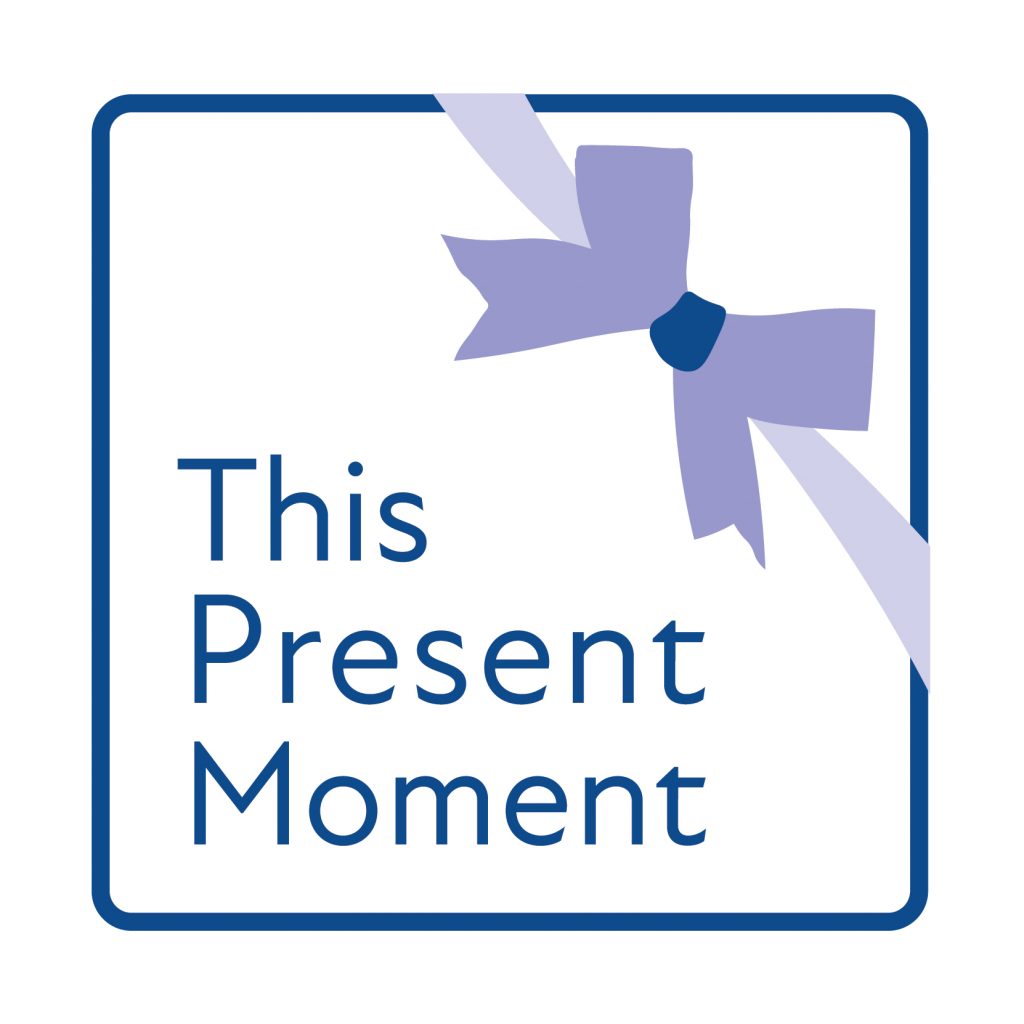
However, I wanted a logo for it, and I had some parameters for it, for my fabulous designer - 83 Media.
I say 'parameters', these quickly became 'constraints'.
I wanted
- square (because, it's then easy to fit logos into the circular boxes that much of social media has)
- probably an outline of a box/present/gift
- company name inside that box
And that's when the name became an issue. Because 'present' and 'moment' balance together well. My issue was this. Literally.
The word 'this' did NOT balance well.
It created too much dead space. It looked tiny compared to the other words. The letter 'T' does not line up nicely, against words beneath it.
Consequently fonts, always important anyway, became more important.
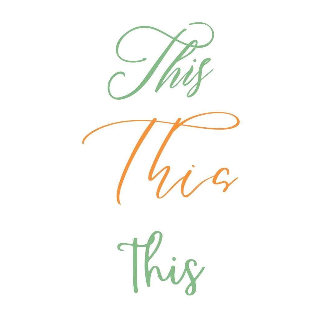
I thought we could make 'This' completely different, with a lovely script font.

The thing about this idea is...this. It becomes illegible. You definitely want a company name to be easy to read. And many script fonts turn an 's' into a squiggle, or something more akin to a 'g'.
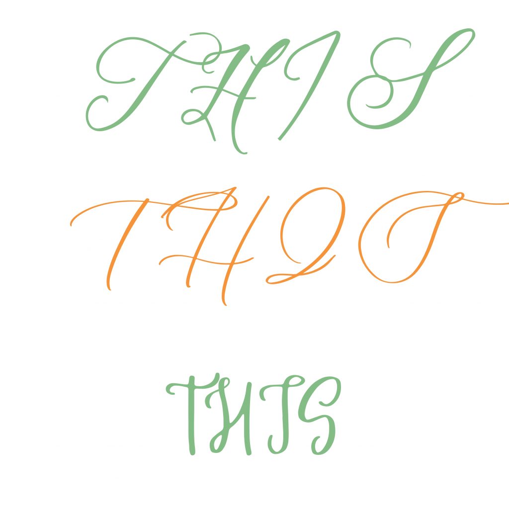
Maybe, though, the whole word could be capitalised?
I mean, I can see how you may think that but...

It's not helped the situation, has it?
In the end, script fonts were abandoned.
Which really only left the pesky letter 'T', at the start of 'This'.
Because, 'T' has issues.
In some fonts, it will align exactly with other letters:
This
Present
Moment
In other fonts, the crossbar of the 'T' will overhang, slightly, to the left (less of an issue with serif fonts, as it happens, more so with sans serif, which is the territory we were in).
To what I can only imagine was the deep joy of Eleanor at 83 Media, I settled on a teeny, tiny overhang, to make the rest of the alignment pleasing.
(I mean, I say 'joy', I think I mean 'relief'). Eleanor, I hope you have some hair left.
Thank you. I love the logo. Even if I did consider changing the business name, along the way.


0 comments